Tuesday, 7 August 2012
reference // source
link to the list of materials used with source:
https://docs.google.com/open?id=0B1RDxqU9eEwoTUNibXZzSFI3Wjg
Video Making // HTML making
I have also created a video clip to show how the interface is used with different transitions and phases by using Premiere Pro.


the entire video is 1 mins 41 sec long that show the overall usage of interface.
Beside, I have also created a HTML using Adobe Firework, that allows people to view the interface design page by page as well as there are also instructions and annotations for each pages:


Some annotations are also added to enhance the understanding of using the app.

the entire video is 1 mins 41 sec long that show the overall usage of interface.
Beside, I have also created a HTML using Adobe Firework, that allows people to view the interface design page by page as well as there are also instructions and annotations for each pages:


Saturday, 4 August 2012
User Testing
I have carried out an informal user testing in MM Lab 5 at The One Academy. I have asked few of my classmates friends to try using the application and see if they are understand, and also to test the ease of use. Users are given a scenario/task which is they have to log in, choose a favourite picture and share it to instagram, then choose another photo source to look for a photo they like and share it on instagram as well, then lastly their task is to collect the photo they like.
Then I have asked them a few questions after they have done navigating:
I have summarized the answers from the respondents/users:
Most of them feel that the application is for entertainment purpose, and one of them mentioned that it is something popular and hit in year 2012 as people like to collect images. They also mentioned that they would like to sign in to even more platforms such as social media like Facebook and Twitter to get more photos besides the three listed in the application.
In term of the readability, they think that it is very easy to read as the colour contrast make things more visible and the layout is organised and neat. They think the application is helpful and user friendly as it allows them to collect and reshare photos they like from many platforms. However, there are also things that they don't like which is they are unable to edit the photo (brightness, contrast etc), and they hardly find the category they want to look at when browsing through the photos feed.
Then I have asked them a few questions after they have done navigating:
1. What do you think the purpose of this application is? (ie. selling, informing, entertainment, etc)
If they think it is a selling app, but it is actually a content information site, question what made them think the purpose was different than it really is.
If they think it is a selling app, but it is actually a content information site, question what made them think the purpose was different than it really is.
2. Was there something missing you were expecting to see?
For prompting, you can ask about more text, more images, a FAQ, a question answered, etc.
For prompting, you can ask about more text, more images, a FAQ, a question answered, etc.
3. Easy to read (both font style and size)?
Was the font size too large or small? Was the chosen font difficult to read or in a color that made the text not as readable as it could have been?
Was the font size too large or small? Was the chosen font difficult to read or in a color that made the text not as readable as it could have been?
4. How did you find the layout of the site?
Was everything organized well and set out as expected? If the layout is not a usual style, question that experience as well.
Was everything organized well and set out as expected? If the layout is not a usual style, question that experience as well.
5. How intuitive and helpful is the navigation system?
6. What would encourage you to return to this application in the future?
Was there something that could have been added to increase the return visitor rate?
Was there something that could have been added to increase the return visitor rate?
7. Name your three favorite things about the application, and your three least favorite
This usually can bring up the unexpected things about your site that either endear people to it, or make them more likely to bounce quickly.
This usually can bring up the unexpected things about your site that either endear people to it, or make them more likely to bounce quickly.
I have summarized the answers from the respondents/users:
Most of them feel that the application is for entertainment purpose, and one of them mentioned that it is something popular and hit in year 2012 as people like to collect images. They also mentioned that they would like to sign in to even more platforms such as social media like Facebook and Twitter to get more photos besides the three listed in the application.
In term of the readability, they think that it is very easy to read as the colour contrast make things more visible and the layout is organised and neat. They think the application is helpful and user friendly as it allows them to collect and reshare photos they like from many platforms. However, there are also things that they don't like which is they are unable to edit the photo (brightness, contrast etc), and they hardly find the category they want to look at when browsing through the photos feed.
Thursday, 2 August 2012
Progress II
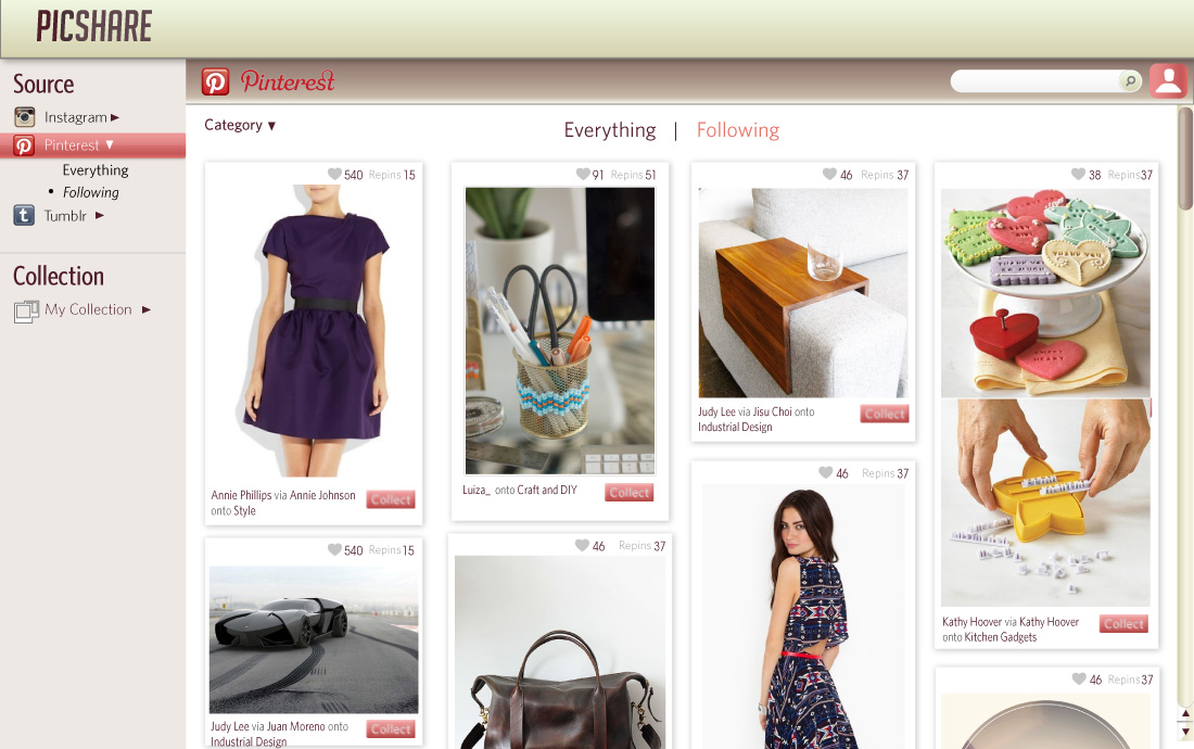
Today, I have improved the design of the page (left column) which is the navigation bar on the left side. I have applied gradient from lighter red to darker red to the buttons so that it would not look too flat and looks more engaging. Beside, I have also added the logo of different photo sharing sites as the icon for each button so that users will easily recognise the link by looking at the icons itself.
I have also decided to use typeface: Whitney HTF in this application. To complete the overall look and design of the photos feed page, I have also added a search bar on the top right corner. The search bar is placed that is because it is easily to be seen.
the design of the button is changed from darker red,
the design of the button is changed from darker red,

to a softer red, and the button doesn't look as flat as previous one:

Apart from this, I have also enhance the design of the top bar of the layout as I have added gradient to it to make it looks more attractive and eye pleasing. Scroll bar is also added to the right side of the page to indicate that the content is scroll-able. All the design elements (buttons, top bar, search bar, scroll bar) will be used for other pages of the application.

Beside designing the layout, I have also designed and created several buttons for the application, all these buttons are used in different page of the application.


At the end of the day, I have done creating the pages of the interface with appropriate design elements.


Progress I
Design Element for Image
I have designed the border and background of the each image that will be shown on photos feed. Each photo will consist the name of uploader, number of "likes", number of comments, the caption of the photo and the tags for the photo. I chose to use white background/border for each image purpose is to highlight the image itself. Users will then easily focus on the images rather than distracted by other design elements. I also applied some drop shadow effect for the background to make the image looks "pop-up".


Then later on, I have created the page where users are able to view particular photo details.
Design for photo details page

On the left side of the page consists of a larger and clearer version of the photo from the photos feed previously once the users click it. Below of the large picture, there are 3 buttons which represent different photo sharing sites (instagram, pinterest, tumblr), the buttons are provided to allow users to choose to where they want to share the particular photo. While on the right side of the page, there are the details of the photo and a space is given for the user to enter the comment. The function is basically the same as the app in mobile. At this stage, the fonts are still not confirmed as everything is still at testing phase. Later I will adjust the typeface and the size to better readability and to suit overall look and feel.
Total hours used = approximately 4 hours
Wednesday, 1 August 2012
Digital sketches
I have done a digital layout of my application using Illustrator:

It turns out that the red colour is overly eye catching and it hurts viewers' eyes too if starring at it for a long period. However this is going to be the layout sketch of my application. It also turns out differently from what I sketched on the paper previously.
Therefore, I have continued to amend the layout (second tryout):

I have reduce the length of the left column on the layout and changed the colour slightly brighter to see if the color is suitable for reading/consuming for long period. However, I found out that the colour is still too bright and the top bar of the application is grabbing too much attention than the other parts. Therefore, I continue amend the layout and this was the second tryout.
I have decided to turn the colour into softer red and created another color palette:

the dominant colour is red (a bit peachy kind of colour) is to soothe the reading and it is also the significant colour of my application. the rest of the colours I have decided to use a range of grey colours because there are plain and not eye catching, so that users can focus more on the images itself while navigating the application.
Then, I have tried to amend the previous layout by using the colour palette that I have created and I also tried to insert some photos for mock up purpose and to test the overall look and feel of the application:

total time used = approximately 4 hours
Tuesday, 31 July 2012
moodboard // art direction
In this application, I hope to emphasize more on the images(photos) and also the important navigation buttons. Therefore I have planned to have a simple and plain yet interesting art direction for my application that I will be creating.
From the research that I have done, I also realised that in order to create a desktop application that is being used for a long period, the colour palette must be narrow and also try to avoid using too many complicated design elements which will distract users' attention. I noticed that most of the desktop applications are using white/grey/silver as the background colour and little colours are being used. Striking/bright colours such as blue, red, yellow and orange are used around 20% of the entire interface. Those colours are also not being used together within the interface of the application.
Below are two examples that showcase images with a plain background. Users will automatically pay their attention to the images itself.


So I have decided to use a plain background to bring out the images more. There are few examples that how my interface going to be like:


Colour
I have decided to use a color palette that contains of a dominant colour - red.
And as background I am using grey/white. so the colour palette will be:
 -The light grey on the extreme left is used for background
-Black colour on the extreme right will be used for text.
-The red colour will be used as the main colour of the interface.
Design Element
There will be not much design elements in my interface as I don't want the users get distracted by other things while navigating. Therefore, the only design element that used in the interface will be the navigation buttons. And here are some examples that show the buttons are going to look like:


Overall moodboard:

From the research that I have done, I also realised that in order to create a desktop application that is being used for a long period, the colour palette must be narrow and also try to avoid using too many complicated design elements which will distract users' attention. I noticed that most of the desktop applications are using white/grey/silver as the background colour and little colours are being used. Striking/bright colours such as blue, red, yellow and orange are used around 20% of the entire interface. Those colours are also not being used together within the interface of the application.
Below are two examples that showcase images with a plain background. Users will automatically pay their attention to the images itself.


So I have decided to use a plain background to bring out the images more. There are few examples that how my interface going to be like:
I have decided to use a color palette that contains of a dominant colour - red.
And as background I am using grey/white. so the colour palette will be:

-Black colour on the extreme right will be used for text.
-The red colour will be used as the main colour of the interface.
Design Element
There will be not much design elements in my interface as I don't want the users get distracted by other things while navigating. Therefore, the only design element that used in the interface will be the navigation buttons. And here are some examples that show the buttons are going to look like:
basically, there are gradient applied on to the buttons. Deboss and Emboss effect are also applied on to the buttons so that the buttons would not look flat and boring. There is also drop shadow being applied on the buttons that make it looks likes it is popping up.

Sketches
rough sketches of layout of Picshare application.

- photo sharing site photos feed
- photo details section

- initial sketches


- details sketches
Digital sketch with annotations:


Use Case Diagram
I have done use case diagrams for my application to show the user experience and the key features of my app.
click on the image below to view the larger version.
or click on the link below to view the PDF file:
https://dl.dropbox.com/u/23409639/ucd.pdf


 Brief description of flow diagram:
1. user logs in to accounts (Instagram/pinterest/tumblr, or all of them)
2. user chooses photo sharing sites to view photos
3. user shares photo and chooses the destination to share the photo.
4. user go back to photos feed and view the photos
5. user chooses and collect the photo they like either from instagram, pinterest, tumblr (as long as they have logged in)
6. user add label and save the photo to their collection
7. after collecting, user can choose to go back to view photos, to share photos or continue collecting photos.
this flow diagram basically shows the user experience where they can view, share and collect photo.
click on the image below to view the larger version.
or click on the link below to view the PDF file:
https://dl.dropbox.com/u/23409639/ucd.pdf


1. user logs in to accounts (Instagram/pinterest/tumblr, or all of them)
2. user chooses photo sharing sites to view photos
3. user shares photo and chooses the destination to share the photo.
4. user go back to photos feed and view the photos
5. user chooses and collect the photo they like either from instagram, pinterest, tumblr (as long as they have logged in)
6. user add label and save the photo to their collection
7. after collecting, user can choose to go back to view photos, to share photos or continue collecting photos.
this flow diagram basically shows the user experience where they can view, share and collect photo.
Subscribe to:
Posts (Atom)